Motion graphics for talking-head videos: the 12-second rule
In a long talking-head video like a lecture or review, alternate full-camera shots, screen zooms, and motion graphics so that no single layout stays on screen for more than 12 seconds.
The REA episode on DevBrother's channel (final cut 15:50) used this rule for 11 full-camera shots, 2 screen zooms, and 22 motion graphics. The rules below come from making that video.
First, find the stretches longer than 12 seconds
Start with the finished cut and mark every stretch where the layout does not change for more than 12 seconds. A face that stays on screen too long, or one screen recording that runs on, shows up here.
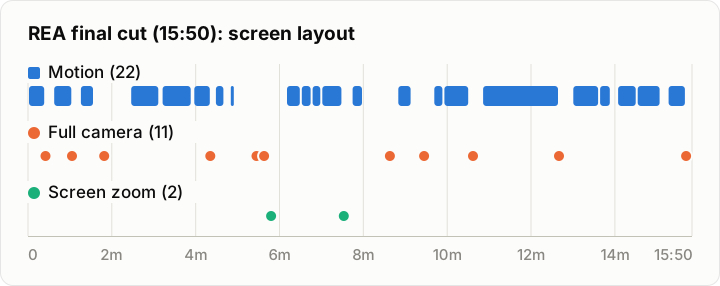
The REA episode after applying this rule. Where there is no bar, the default layout plays: the screen recording with a small camera (PIP) on top. Each dot marks where a full-camera shot or a screen zoom starts.
Three ways to break it up
- Full camera: switch the middle of a screen recording to the face for a moment. The REA episode did this in 11 places.
- Screen zoom: zoom into part of the screen recording. The REA episode did this in 2 places.
- Motion: add a picture made to match the line. In the REA episode, 22 motion graphics covered about 66% of the final cut (625 seconds).

Full camera
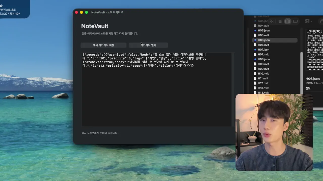
Screen zoom
Motion
In motion, one line becomes one picture
For every scene, start with the question "how would this line look as one picture?"
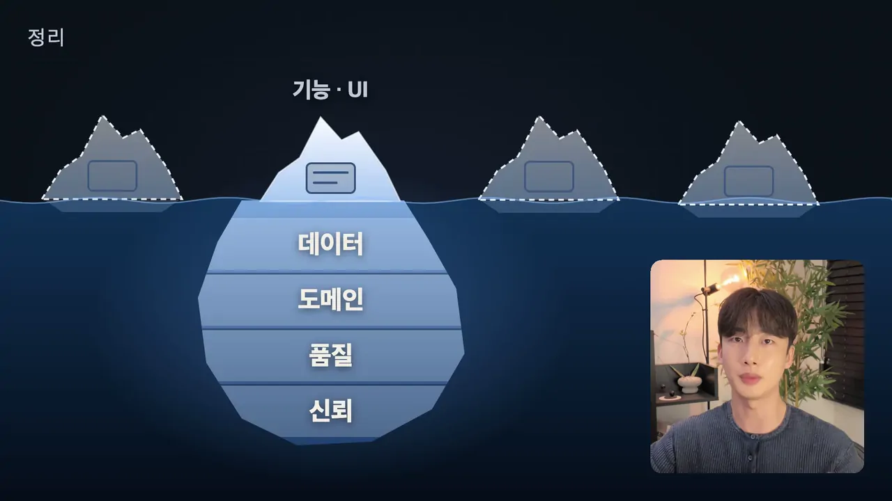
- Metaphor: an iceberg (only the surface gets copied), a rising tide (an edge that sinks as models improve), a balloon (inflated hype)
- Change of state: a grid that flips to all passing, a lock that opens
- Flow: a web page that drops into a copy mold
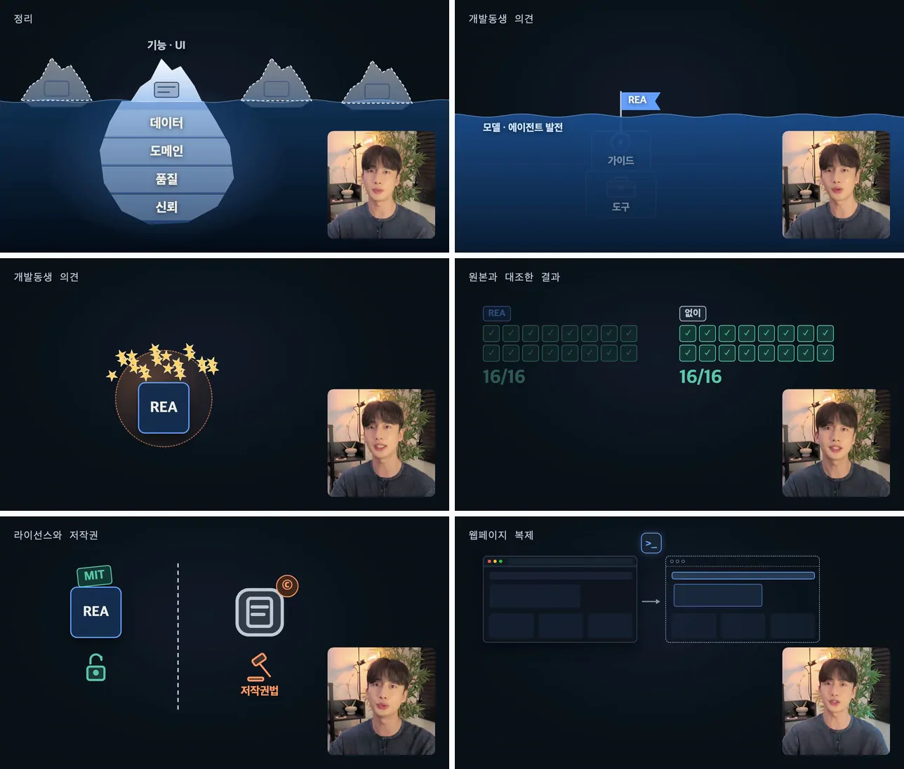
From the top left: the iceberg, the rising tide, the balloon, the grid that flips to passing, the lock that opens, and the web page that drops into a copy mold (REA episode).
Text is limited to single-word labels at 40 px or larger. Text in the 20 px range from a 1080p recording stays unreadable on a phone even when zoomed. Only where the original text is the information itself, like an actual prompt, an install command, JSON, or a legal clause, does it appear as a source card, with a highlight box moving to the part being discussed.
Fully in place 0.45 seconds before the line
Elements should already be fully in place when the word is said. So the entrance animation starts 0.45 seconds early. If the picture starts moving after the word is spoken, it looks like it is lagging behind.
Leave room for the camera
The camera stays on screen as a small picture-in-picture (PIP) while a motion plays. So the drawing leaves the camera's spot empty. Background art like water can run behind the camera.
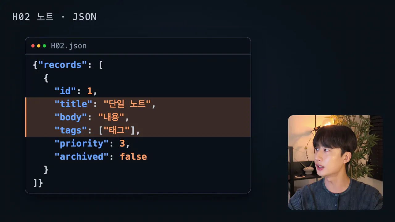
Leave the bottom-right camera spot empty and place the picture to its left (a source card from the REA episode).
Watch how much the motion covers
The more motion there is, the less of the real screen demo is shown. In the REA episode, motion covered about 66% of the final cut. When adding motion, also list the places where the screen alone is enough, the candidates to delete.
Check for overlaps every 0.1 seconds before rendering
Looking at a few key frames misses overlaps during transitions, like a falling box or a changing title crossing over something for a moment. So before rendering, each scene is drawn every 0.1 seconds, the positions of text and boxes are measured, and any overlap between elements is flagged.
The order in CutZal
- Register the rendered motion files as assets.
- Switch the camera to a small picture-in-picture (PIP) wherever a motion plays.
- Place the motion clips at their output times in the final cut.
- Capture the scenes to check for overlaps and gaps.
When an agent does the work, have it follow the same order with the cutzal command. The list of commands is in the CutZal for AI agents docs.
If this rule changes in a later video, this post will change with it. Next time you add motion to a long video, try the 12-second rule first.